Wedding Widget
Nov 4, 2021
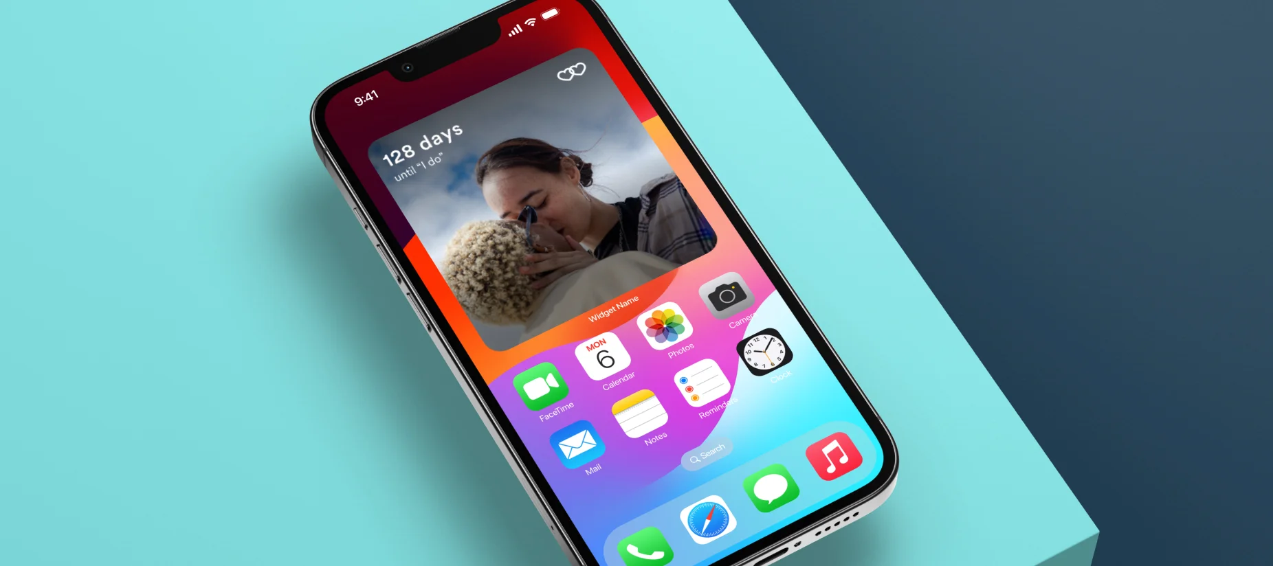
Count down the days until "I do"
Apple's new iOS allowed users to create app-specific widgets for use on the home screen. From listening to newly engaged couples, we discovered an appetite for a wedding countdown that could be easily accessed, so we wanted to build our own widget.
Our basic assumptions were that it would need to be customizable with a wedding date and photo. The engineering effort was already half done from a recent hackathon effort, so the motivation and support to get this project over the finish line were high.
Objective & KPI's
Create a fun widget that couples are excited to use on their phone home screen that brings them back into the app, thereby driving an increase in DAU's.
Adoption rate
% increase in return visits for users who have widgets installed
% increase in DAU overall
Team
I worked as the sole designer and solicited feedback from key partners in Product, Engineering, Marketing, and Data.
Timeline
"How far can you get in a week?"
Ready, set, go
I had a good foundation of context to work from and a healthy amount of space to play. I researched a bit and then explored a range of visual, content, and interaction designs.
Research
Given the timeline, this was not extensive but just enough research. First, I consumed Apple's documentation. Next, I studied my own phone and analyzed some early widgets that were already available, grabbing screenshots for future reference. I conducted informal contextual inquiries with two people — observing their usage, asking questions, and verifying that what I saw on my device was similar on theirs.

Setup
Figma was relatively new to us in a team context. Building components and getting feedback in the file was relatively novel and satisfying. For consistency, I collected existing icons and defined known styles since Zola's full design system had not yet been established. I jotted down a simple flow and outlined considerations into a few buckets of effort to keep things organized.

Visual
Background: solid/photo, dark/light, contrast
Text: color options, font options, readability
Layout: sizes, alignment, spacing, aspect ratios
Content
Wedding info: wedding date, time units, couple names, notifications, after the wedding day
Brand: logo/logotype, relative scale, decorative elements
Interaction
Education: literal instruction, visual guidance
Controls: date input, size selection, photo upload, color/contrast, text treatment
Layout: hierarchy, preview with controls
Exploration
To facilitate rapid progress, I mocked up several options up front. These first iterations included quite a bit of noise and felt semi-weak by my own standards. However, by getting them in front of teammates early, I was able to get the feedback needed for quick alignment. Removing tiny images and decorative elements helped. Still, there was too much going on (e.g., notifications and long “your wedding” text), especially for the small and medium-sized widgets.
With my “fewer things better” approach, I gained support for reducing notifications and aiming for even greater simplicity with user options and content.

App widgets were new, requiring user orientation. The UI needed to provide clear visual feedback (a preview) for effective UX on small screens. Initial designs met basic needs but improved in later iterations as expected. After my copy team partner made minor adjustments, we were ready to build.

During a company rebrand the following year, widget designs held up well, with only minor styling changes implemented.

Performance
30 days after launch, engagement exceeded expectations:
11% of MAU's added the widget
2% increase in DAU's
16% lift on average # of days active per user
60% personalized with their own photo
Next Steps
Build and release the Android version. Market via CRM email and notifications. Incorporate countdown widgets in other “download the app” campaigns.
Takeaways
Couples like seeing their own photo in there. Fewer things better.
On the App Store
With over 82K ratings, the Zola iOS app stays at the top of the charts.
⭐ 4.9 stars
🏆 Editor's Choice Award
⬇️ Download

